Tag Archives: christoph hammann

Film Matters — The Choice of Film in a Digital Workflow

Film Matters

Text and images by Christoph Hammann for Japan Exposures

If you‘re using color negative film in a hybrid workflow, does it matter what film you use? Or is it true that you can do everything in post-processing? Essentially, in the digital age, what exactly does your choice of film itself bring to the table?

I had occasion to ponder these questions while testing the new Kodak Ektar 100 against DNP’s Centuria 100 film. While the former is lauded far and wide for it‘s fine grain and color reproduction, the latter is said to be a no-frills, mass-market oriented version of Konica‘s color negative film with high color saturation.
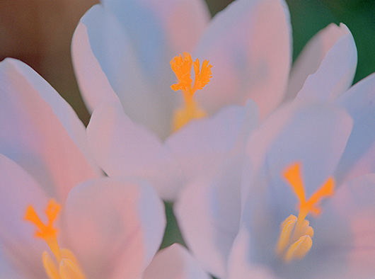
DNP Centuria 100
DNP Centuria 100

For the purpose of this comparison, I took photos of a field of crocuses in Düsseldorf‘s Nordpark at the beginning of February. In most shots, I used a Micro-Nikkor 105 VR and a R1C1 macro flash kit with colored gels.

DNP Centuria 100
DNP Centuria 100

I also used these two films in a studio lighting workshop held by Jens Brüggemann. This proved to be an excellent learning experience! The shot above shows a mixed light situation (daylight from above and the flashes modeling light out of a huge umbrella from front left) rendered by the Dai Nippon Printing film.

The lead image on top shows Kodak Ektar coping with light from two strip softboxes aimed at the model from 90 degrees left and right.

Apart from these single images, how did the test go?

Methodology first: I took care to develop the films the same way, putting one of each in a Jobo 1520 tank and developing them with the Naniwa Color Kit N.

Film Matters

The negatives were scanned with a Minolta Dimage Scan Elite 5400, using no anti-grain dithering and the same light grain reduction in both films.
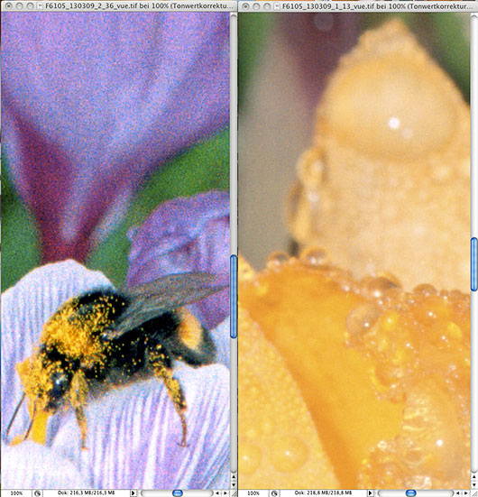
DNP Centuria 100 at left, Kodak Ektar at right

Grain did indeed turn out to be a major difference between the two films. The 100% crops in the picture above had their levels adjusted, but were not sharpened or reduced in grain. Kodak‘s claims of extremely fine grain for the Ektar are fully justified.

DNP Centuria 100 on top, Kodak Ektar at the bottom

Color balance was markedly different, too. The prohibition sign in the picture above was photographed with the macro flash (without gel filter, of course!) and white-balanced with a levels layer on the white circle denoting the bike‘s crankset. The sign‘s colors weren‘t nearly as garish as the DNP film makes them look, more faded and muted as in the Ektar version. So, a high saturation color negative film the DNP Centuria 100 surely is!
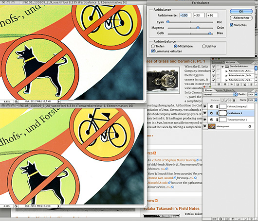
DNP Centuria 100 on top being color corrected with a color balance and a saturation layer

When I tried cheating and to adapt the color correction of DNP Centuria to match the one of Kodak Ektar with layers in Photoshop, the green parts of the sign quickly fell apart along the film grain. I could neither get the same yellow nor do much about the saturation. They don‘t call it a color balance for nothing!

DNP Centuria 100 at left, Kodak Ektar at right

Skin tones suffer under the DNP film‘s color rendering, while I find Ektar‘s skin tones to be quite natural. Granted, these are two different models with different casts to their skin, but the left one wasn‘t that orange-y. And to be fair, the all-rounder DNP 100 has never claimed to be a portrait film.

If all that sounds like I‘m slamming the DNP Centuria 100 film, making an easy target out of it, I‘m not. In the crocus shots, I actually prefered it‘s saturation and color rendition. I also see a role for it photographing urban environments in their multicolored facets and a kind of grainy hastiness. Kodak‘s new Ektar is more true to life, though — mind you, it‘s colors are saturated enough. It has stunningly small and unobtrusive grain. If you are attracted by peculiar color and light combinations and want to capture them just the way you saw them, this is the film for you.

You have the choice, and that‘s the beauty of using film for color photography. Your results don‘t have to be predetermined by the sensor in your digital camera. Film matters, so take your pick and have fun.


Christoph Hammann is a fine art photographer from Waltershausen, Germany. He works with traditional film and silver halide papers as well as digital post-processing and alternative printing techniques. His website is “Mostly Black & White”.


 We have DNP Centuria 100 film available at very attractive prices in our web shop. Why not treat yourself to an abundant 100 pack for summer?

X-mas crossed: processing slide film with the Naniwa Colorkit N

Text and images by Christoph Hammann for Japan Exposures

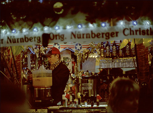
Germany is full of Christmas fairs this time of the year. They are to be found in every larger town and even in some villages. Visually, they are an assault of colored lights, vivid vendor‘s stalls and people mingling and socializing while sipping Glühwein (mulled wine) and nibbling Lebkuchen (gingerbread).

C Hammann Naniwa Cross Process Review

What better to represent this mood photographically than cross-developed color slide film? So I found myself visiting the Nordhausen Christmas fair on the first Advent Sunday with my Nikon S3, Nikkor-P.C 1:2 f= 8.5 cm lens on it and Fujifilm Provia 400X in it.

Back home, I developed the film as if it were a C41 color negative film. I used the Naniwa Color Kit N with exactly the same procedure as in my previous article. Cross-development is always kind of an experiment, and you get surprising results.

As I said, Glühwein is an important part of the German Christmas fair experience, this vendor was happily counting his revenues.

C Hammann Naniwa Cross Process Review

These fellows seem to have consumed a fair amount of the spiced red wine.

C Hammann Naniwa Cross Process Review

The tonality lends a dystopic mood to the cosy scene, colors are rendered a bit off, gradation is steep and saturation is way up for some colors and rather subdued for others.

These are the results if you choose to scan the cross-developed slide film as a color negative film. It looks that way, too, minus the orange mask.

But sometimes you chance upon a „negative“ that makes sense as it is. So then you can of course scan it as the slide film that it was before you mistreated it in C41 chemistry. This is what that looks like after some levels and curves in Vuescan:

C Hammann Naniwa Cross Process Review

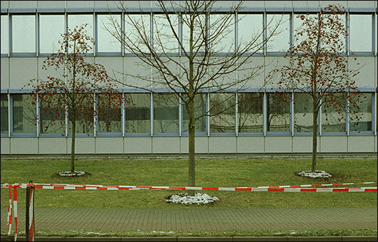
Here, of course, we‘re no longer at the Christmas fair, this is the facade of Jenoptic, one company that split off the east german branch of Zeiss.

After some straightening in Photoshop, you get the instant Warhologram that is the image at the top.

This is what this picture would have looked like had I scanned it as a negative:
C Hammann Naniwa Cross Process Review

I think I like both ways of treating cross-processed slide film in post-processing. Each one has it’s own creative possibilities.

So, if your lab would scoff at you for such an unreasonable demand, why not try it yourself? Dunk the wrong kind of film into the Naniwa Color Kit N and see what you get. It’s easy and fun!

Merry Cross-mas!


Christoph Hammann is a fine art photographer from Waltershausen, Germany. He works with traditional film and silver halide papers as well as digital post-processing and alternative printing techniques. His website is “Mostly Black & White”.

Developing color negative film with the Naniwa Colorkit N


Text and images by Christoph Hammann for Japan Exposures

When I took up a new project this fall, I decided to try my hand at developing color negative film. This is supposed to be difficult and prone to developing errors. In fact, though I had bought some Fuji Pro800 rollfilm and a Naniwa Colorkit N C-41 developing kit earlier, I held them back for just such fears. Then when the fall color got very intense this year, I couldn‘t go on photographing in black & white. The first two rolls of 120 film I dropped off at my local photo shop, getting a digi-evangelization in the process. They came back developed rather grainy and the test prints were off-color. Having them developed wasn‘t cheap either!

This I can do better, I thought.

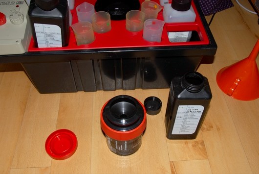
Turns out I was right! Here‘s the material I used:

The temperature was kept constant at 30 °C with a Jobo Temperbox TBE2, essentially a heated water bath with a thermostat and receptables for bottles, graduated beakers and the developing drum. I collected some exposed rolls of Fuji Pro800 and proceeded to mix the solutions.

The Naniwa Colorkit N comes with concise, clear instructions in English in addition to Japanese, for which I was grateful…

Mixing the solutions

The developer takes on an appealing pink color once mixed. The blix (short for bleach/fixer) on the other hand is of an ugly brownish cast and smells bad.

Developer and Blix

Ready to start developing. Times for all C41 process films seem to be the same regardless of ISO, as long as you expose them at their native ISO. So this is how those automatic minilabs work! The kit comes with tables for dev times for push development plus one or two stops, too.

Pouring back the developer and getting ready to blix it.

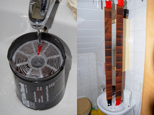
Watering at about 30 °C and for a defined time, this washes out some of the orange mask. My first two self-developed rolls of color negative film hanging to dry!

Rinsing and drying

This works for sheet film, too. I used Fujifilm 160 NS 8×10 in film, the developing drum this time was an old Durst Codrum originally meant for the Cibachrome process.

It has ridges inside so the film comes into contact with the chemicals from both sides and takes 200 ml of solutions.
Sheet film processing

Getting it out of the drum without scratching the delicate, wet emulsion is best done with the drum filled with water to the top.

To end with, here are some results.

The shot at the top is the 8″x10″ nighttime shot, I was delighted that the film could render the different colors of lighting and had such a high latitude and subtle graduation of tones. Exposure time was 8 minutes at f/45.

Diffugium

This picture is from the fall colors project called „diffugium“. The Fuji Pro800 rollfilm proved to be quite fine-grained, the negatives were easy to scan and the pictures were versatile in post-processing in Photoshop.
Diffugium

For example, as this picture from the same roll of film (but from a different project) shows, it is easy to increase saturation and still keep good colors.

I will definitely be using these films and the Naniwa Colorkit N for current and future color projects.

Coming soon: Christoph will use the Naniwa Color Kit N to cross-process some slide film.


Christoph Hammann is a fine art photographer from Waltershausen, Germany. He works with traditional film and silver halide papers as well as digital post-processing and alternative printing techniques. His website is “Mostly Black & White”.